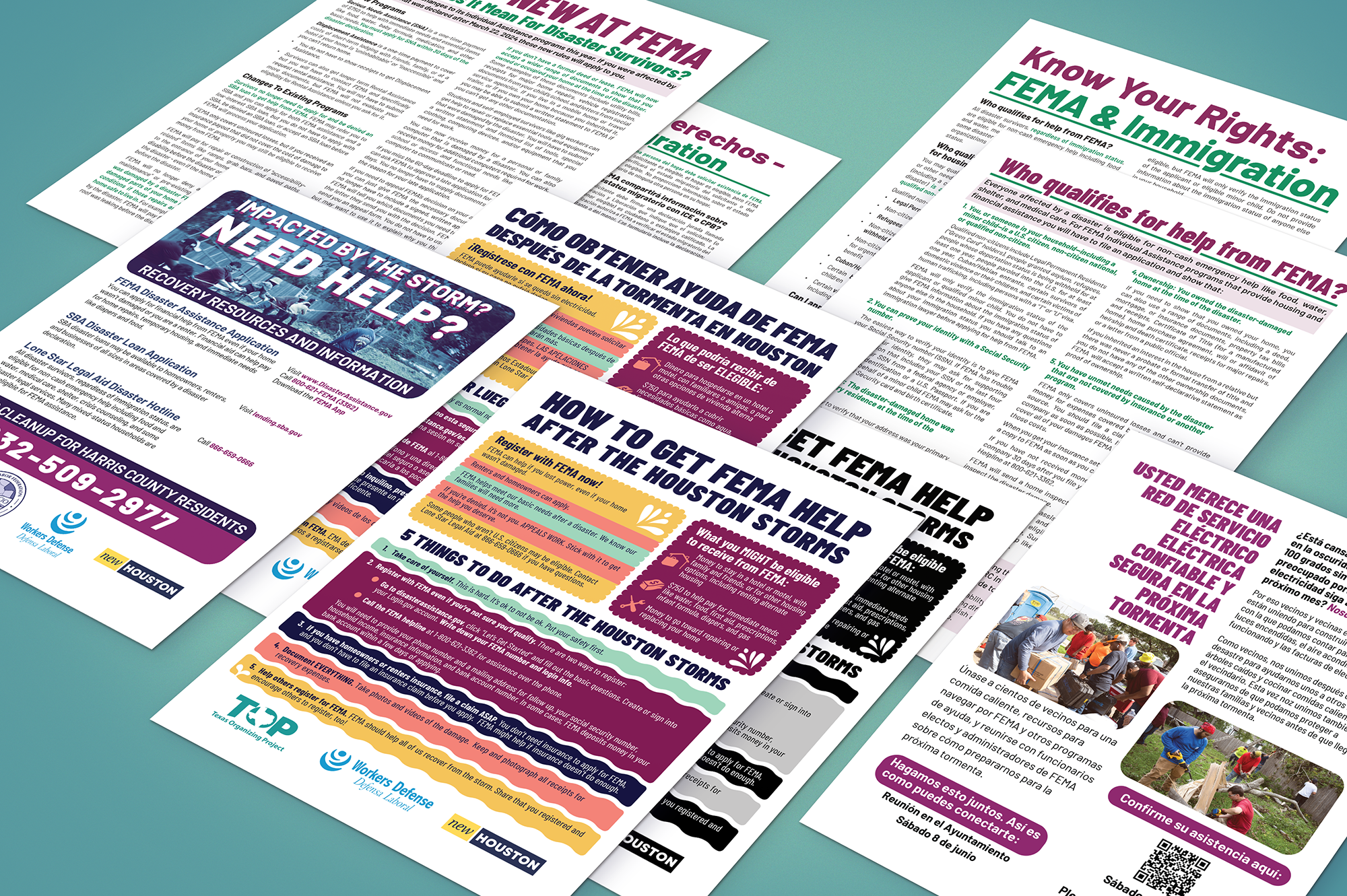
Info Sheets
Contribution: Design, Graphics, Editing (logos were provided by client)
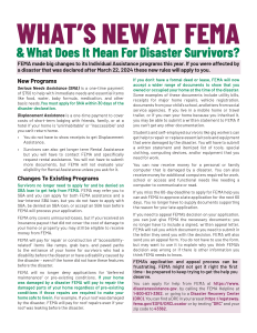
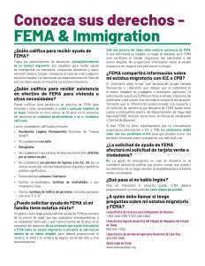
I worked a series of information sheets for an alliance of organizations that help those affected by storms and other disasters. The objective was to create engaging, easy-to-read fact sheets in a format that could be quickly printed and distributed in response to the Houston storms.
For the first flyer, the client wanted to steer clear of a somber tone and create a positive and community-focused design. My part in this began with collaborating with the writer to condense the key content to one page. I then used Adobe Illustrator to create graphics and design the layout. I selected the Barlow typeface for its flexibility and support of multiple languages, as the client required a Spanish version and wanted to be ready for the possibility of adding other languages.
In order to facilitate easy printing, the design includes margins large enough to print on any home printer. I also created black-and-white versions for environments without color printing.
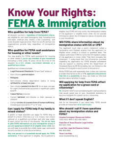
Handouts
These handouts were needed for distribution to attendees at various community events. Adopting a minimal style put the focus on content and supported the dense information, ensuring each topic fit on one page. Using Adobe InDesign facilitated consistency across different handouts and language versions by defining paragraph and character styles.
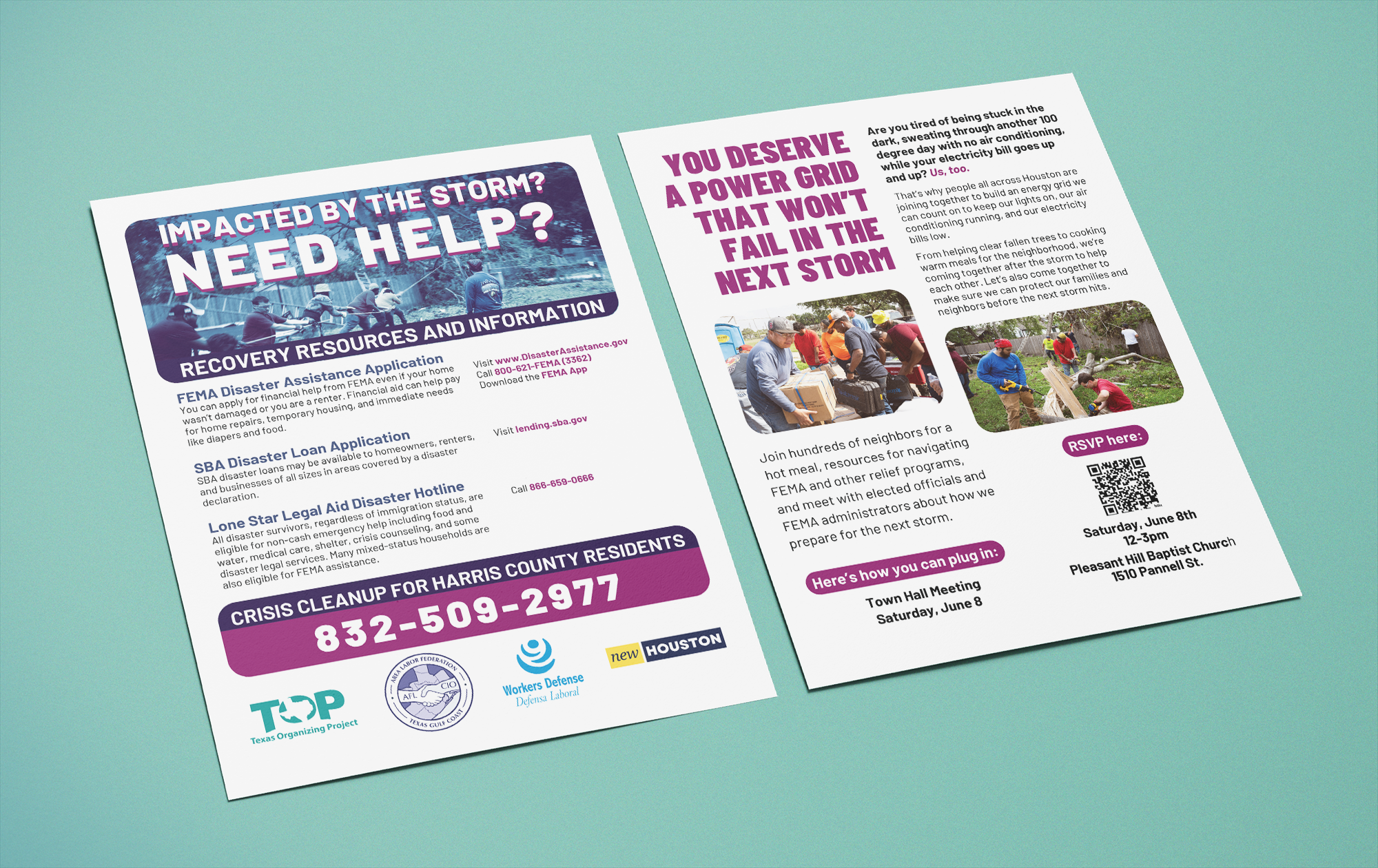
Walk Piece
Contribution: Design, Graphics, Photo Sourcing and Retouching (logos were provided by client)
Organizers distributed this double-sided flyer while walking through their communities. To meet the needs of the various organizations involved, I created and shared the design in Canva, allowing groups to quickly update details about upcoming meetings and how to get involved.